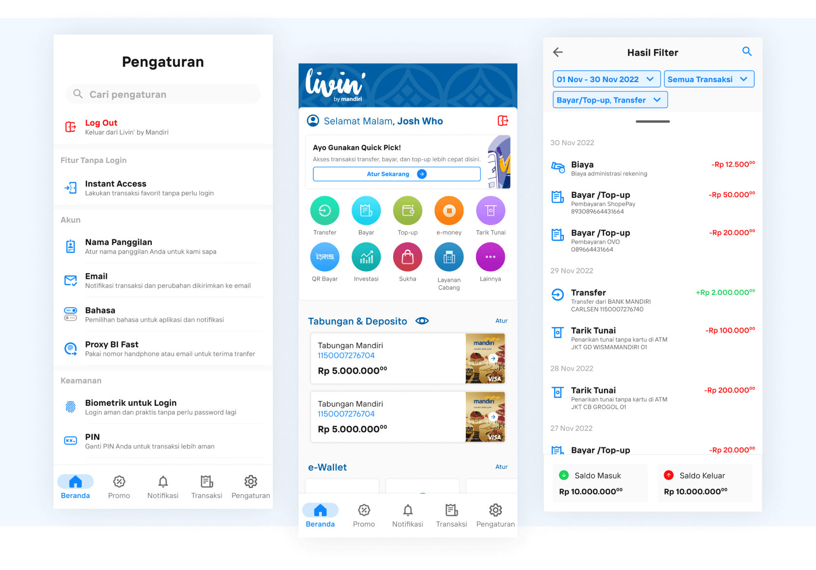
Hello!, this article will cover Livin by Mandiri redesign process.
Livin' by Mandiri is a mobile banking application that is integrated with Bank Mandiri banking services and its digital ecosystem. However, some users reported negative responses regarding usability aspects.
Background
The Livin by Mandiri mobile banking application is Bank Mandiri's answer to the demands of the global trend of digitizing banking services. Bank Mandiri took advantage of the momentum of the COVID-19 pandemic in 2020
The Livin' by Mandiri application has indeed succeeded and a game changer for Bank Mandiri's digital services. However, some users have negative responses through review on the Google Play Store page of the Livin' by Mandiri application.
Read : Sentiment Analysis of Google Play Reviews Using Python Case Study : Livin' by Mandiri Version 1.1.3
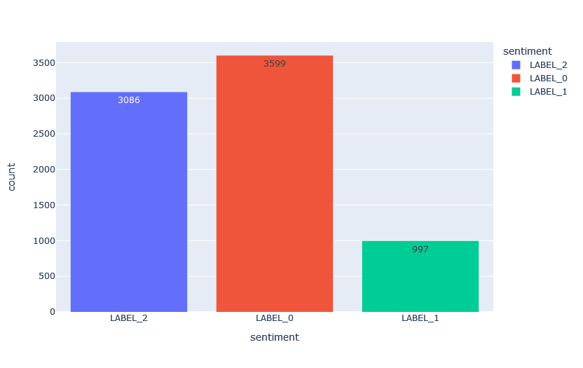
As you can see the image shown above, the result of the Google Play Reviews sentiment analysis for version 1.1.3 are:
- LABEL_0 - Positive, the first graph shows that there are a total of 3559 users were given positive sentiment towards the application
- LABEL_1 - Neutral, the graph shows that there are a total of 997 users or almost 1000 users were neutral about the application
- LABEL_2 - Negative, the last graph shows that 3086 users had a negative sentiment towards the application. However, the number of negative and positive sentiments is quite close, compared to the neutral sentiment.
Based on the Label_2 or Negative sentiment, it was concluded that there are things that need to be improved in the application. In this case, most of the users complain about usability issues.
Goals
After defining the background, I must have to set the requirement to achieve the goals for this project. The requirements are set below:
- Evaluate the application using usability testing, including SUS Questionnaire to measure usability value, and user interviews to investigate usability problems.
- The application will be redesigned based on the evaluation results and using Google Material Design as a design guideline. The final product will be presented as a High-Fidelity Prototype
- Evaluate it again, but this time with the prototype. The final evaluation is conducted for measuring usability to see if the value has increased since the initial evaluation
User Identification
The first thing that I need to do is interview the stakeholders of this app, who can provide me with deep information about the purpose of Livin' by Mandiri development, the most used features in the app, and the number of registered users.
There are two key insight that came out of the interview:
- Most Used Feature
- Transfer
- Top-up
- Bayar
- e-money
- Quick Pick
- Respondent Requirement
- Respondent must be in the age group of 19 - 25 years old (young adult) and 26 - 40 years old (workers)
- Respondent must be in the group of new user (< 1 month) or passive user (rarely use the app)
To choose the right respondent who meets the requirements, I decided to use Google Forms as a media selection tool and 20 respondents were selected
Task Scenario
Creating 5 task scenarios based on the most used features within the app.
| Task | Scenario |
|---|---|
| TS01 | Make a money transfer to a selected bank account with an amount of Rp.5.000. |
| TS02 | Top up the balance of an e-wallet account with an amount of Rp.20.000. |
| TS03 | Create a favorite transaction from the latest e-wallet top-up with an amount of Rp 20.000. |
| TS04 | Integrate your favorite e-wallet with Livin' by Mandiri |
| TS05 | Search for past transactions from 1 month ago with selected transaction categories. |
Initial Evaluation
There are 4 aspects of usability that will be measured using usability testing: learnability, efficiency, error, and satisfaction to gather quantitative data. Additionally, user problems will be acquired using user interviews to gather qualitative data.
Usability Testing
The test will be conducted remotely via Zoom Meeting. The respondent will read the consent of recording out loud, and then I will brief them on what they need to do and not do. The test will begin when the respondent shares their screen.
| Aspect | Metric | Result |
|---|---|---|
| Learnability | Success Rate | 68% |
| Efficiency | Time-Based Efficiency | 0,013189 goals/sec |
| Error | Error Rate | 33,28% |
| Satisfaction | SUS | 73,5 |
Based on the quantitative results shown above, it was concluded that the application needs to be improved in terms of usability or user experience, so the usability value should increase.
User Interview
The following table contains questions that were asked during user interviews:
| No | Question |
|---|---|
| 1 | What do you think about the task overall? |
| 2 | What's your favorite feature? Why? |
| 3 | What's a feature you don't like? Why? |
| 4 | To improve the overall mobile banking experience, what needs to be fixed or added? Why? |
Here are few examples of user problems from a total of 20 list that were analyzed after user interviews:
| Code | Description |
|---|---|
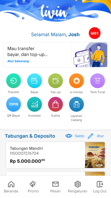
| M01 | There is no guide for new users who have just installed the application, or for new features or first-time users. |
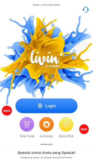
| M02 | The placement of some menus is not very eye-catching. |
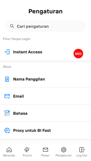
| M03 | The use of writting in some sub-menus is not giving enough information. |
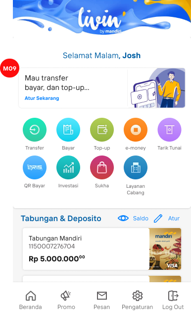
| M09 | The Quick Pick feature on the home page is not well-notice for user and for its function. |
| M19 | If you want to use the QRIS feature only, you need to log in. |
Redesign Phase
The design guidelines I use are from Google Material Design which can help me on creating a user interface with the components and style which they already have
Then, I'm connecting the dots to create design recommendations using Google's components and style that can fit on the interface to solve the user problems shown above.
Here are few examples of design recommendations from a total of 20 list that were created with Google Material Design:
| Code | Description | Components |
|---|---|---|
| M01 | There is no guide for new users who have just installed the application, or for new features or first-time users. | Dialogs, Button |
| M02 | The placement of some menus is not very eye-catching. | Layout |
| M03 | The use of narration in some sub-menus is not giving enough information. | Typography |
| M09 | The Quick Pick feature on the home page is not well-notice for user and for its function. | Iconography, Button |
| M19 | If you want to use the QRIS feature only, you need to log in. | Button |
Before and After
The image below shows a comparison of the before and after redesign, including the reason why it needed improvement:
| Before | After |
|---|---|
 |
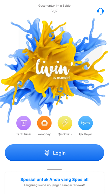 |
| For M02, the layout position of the Login button must be consistent and adaptive to user input. For M19, a QRIS button is needed for quick access. | The position of the Login button and the menu are being repositioned so that users can reach the Login button with their thumbs. A QRIS button is being added so that users can pay without logging in. |
| Before | After |
 |
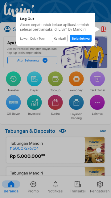 |
| The problem here, There is no onboarding guide for new users who have just installed the application. | Added a quick tour or dialog feature that contains the name and description of the features so that users can be introduced to some of the existing and new features of the Livin' by Mandiri. |
| Before | After |
 |
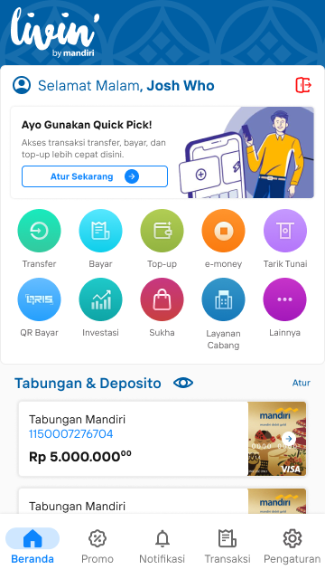 |
| As we can see that, the Quick Pick feature on the home page is not recognize for its function and also unnoticeable. | Added a button with an arrow icon to emphasize the information that the feature leads to the Quick Pick page so that users are aware that the element can be clicked and also cards components is resized |
| Before | After |
 |
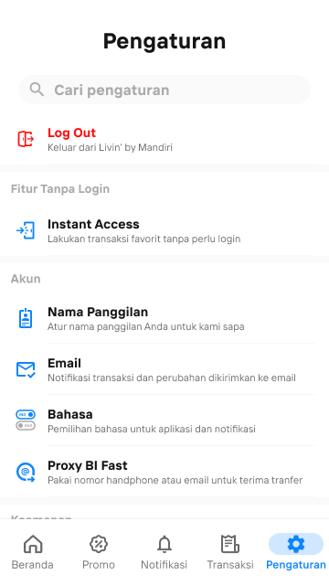 |
| The image shows that writting in some sub-menus does not provide any information to users. | Added text to the second line of each setting menu. The text on the second line should make the function of each menu clear to users. |
Please click this icon to try in full-size mode for a better experience.
Final Evaluation
The final evaluation will evaluate 4 aspects of usability that will be measured using usability testing: learnability, efficiency, error, and satisfaction using usability testing. Additionally, the initial and final results of the evaluation will be compared to determine whether the user experience of Livin' by Mandiri has improved.
The test will be the same as before, remotely via Zoom Meeting. The test will begin when the respondent shares their screen. here are the result of the final evaluation:
| Aspect | Metric | Result |
|---|---|---|
| Learnability | Success Rate | 93% |
| Efficiency | Time-Based Efficiency | 0,026295 goals/sec |
| Error | Error Rate | 2,34% |
| Satisfaction | SUS | 84,4 |
The compared usability testing result between two evaluation are shown below:
| Aspect | Initial | Final | Improvement |
|---|---|---|---|
| Learnability | 68% | 93% | 25% |
| Efficiency | 0,013189 goals/sec | 0,026295 goals/sec | 0,013106 goals/sec |
| Error | 33,28% | 2,34% | 30,94% |
| Satisfaction | 73,5 | 84,4 | 10,9 |
The improvement of the usability aspect after the final evaluation shows that the UI and UX redesign of Livin' by Mandiri has been successful in solve the usability problems experienced by the respondents during the initial evaluation.
