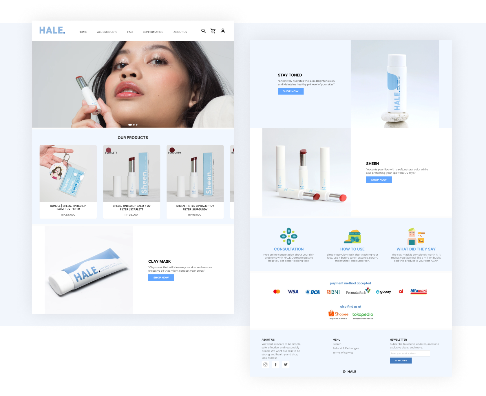
Hello!, this article will cover Hale id web redesign.
Hale.id is an e-commerce platform that provides skincare products for everyone. The class project began with the lecturer giving us the freedom to choose whatever product needed to be redesigned, and my team decided to pick the hale.id website.
Goals
Main reason this web was picked by us is that their product seemed not to be featured on the main page, and the information provided was not straightforward for the users. The main goals of the redesign were to emphasize the products offered by the brand. For the redesign process, we focused only on the website.
Visual Concept
- Simple, clean, straightforward
- Light background
- Lots of whitespace
- Light typography
- Clean layout
Here are the before and after images of the website redesign:
Before

The image after the website redesign is presented using Figma:
After
Please click this icon to try in full-size mode for a better experience.
